
Concept build · House painter · Essex County, NJ
A painting company's site that is actually made of paint
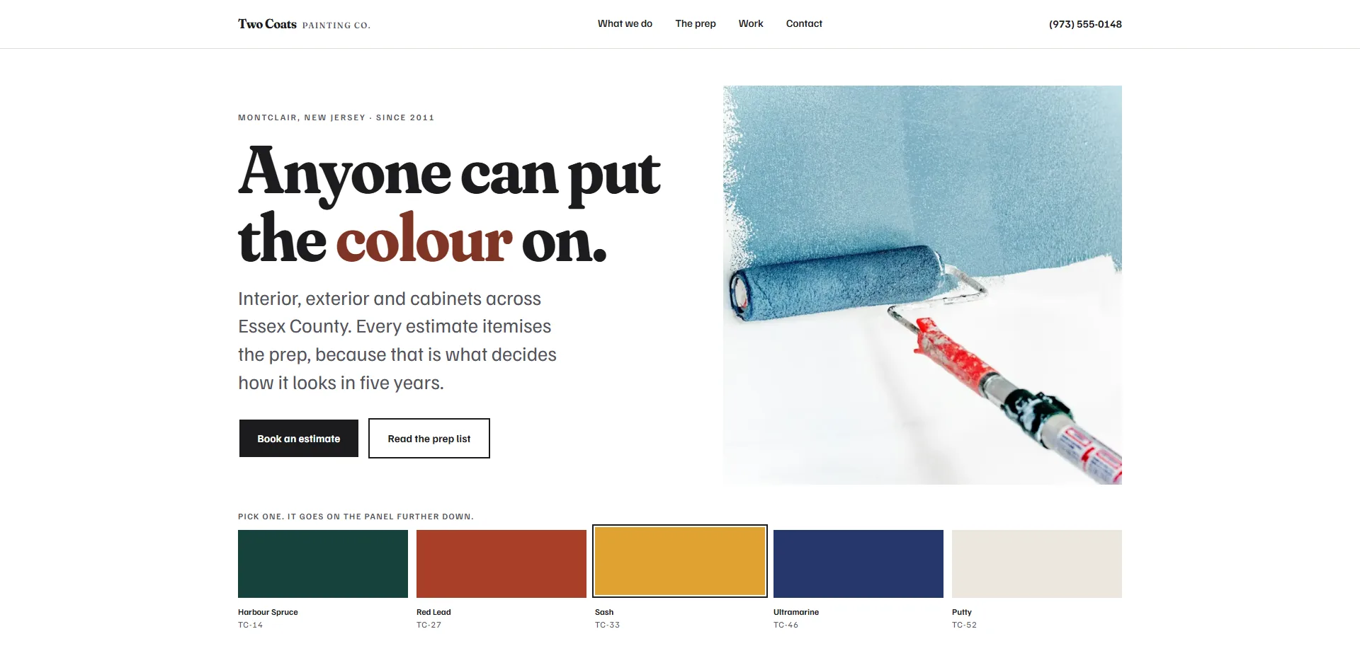
Two Coats is a concept build. Painting is the one trade whose entire product is colour, and not one painter's website uses colour as an idea. They all use the same photograph of a house with white type over it. So this one is built out of the deck: full-bleed fields of named colour with their codes beside them, and a fan deck on the home page you can pick from.
- Type
- Concept build, not a client site
- Trade
- Interior, exterior and cabinet painting
- Pages
- Six
- First screen
- 90 KB over seven requests
- Third-party scripts
- None
01
The sections are paint, not containers
Every band on the site is a full-bleed field of one colour off a five-colour deck, each one named and coded the way a rep would say it: Harbour Spruce TC-14, Red Lead TC-27, Sash TC-33, Ultramarine TC-46, Putty TC-52. The fields do not meet on a straight line. They meet on a roller edge, drawn as an SVG with the ragged top and the occasional drip a real cut line has.
The surface between them is white, the way a wall is white before anyone has decided anything. That is the whole layout system. There is no card, no shadow and no rounded rectangle anywhere on the site.
02
The deck on the home page does something
Five swatches sit under the headline, and picking one repaints the panel further down the page in that colour, including the roller edges above and below it. It is the one thing a visitor to a painter's website actually wants to do, and no painter's website lets them.
It works with a keyboard, announces the change to a screen reader, and with JavaScript switched off the swatches are still five labelled colours with their codes, which is a fan deck. Nothing is hidden waiting for a script to reveal it.
03
Ochre is the reason this needed measuring
Every pairing on the site was scored with APCA before it was used, and Sash, the ochre, failed. Near-black on it reads Lc 58. It gets worse if you darken the ochre, because that moves the field toward the type, and lightening it far enough to carry body copy turns it into a pale cream and stops it being a bold field at all.
So Sash carries display type only, 40px and up, where Lc 58 is within grade. No paragraph ever sits on it, the header holds the wall colour when it passes over that band, and the small deck codes on it go on a strip of white the way a name is printed on a real chip. One colour set the rules for three other decisions.
04
The header is painted along with the page
Scroll past Harbour Spruce and the header is spruce. Past Ultramarine and it is marine. The browser's own chrome goes with it, so on a phone the notch and the address bar are painted too. Every page declares the band it opens on, which means that with JavaScript off the header still opens on the right colour instead of sitting white above a red band.
All of it is off under prefers-reduced-motion, and the hero photograph is never hidden by the paint panel that wipes off it, so none of this costs anything in loading time.
05
Fraunces, because signwriting and house painting are one trade
Six display faces were set at the same size on the real headline and the real colour band before one was chosen. Fraunces won on heritage as much as on looks: it is a signwriter's serif, and hand-lettered signs and house painting came out of the same shops. Its WONK axis puts a deliberate irregularity into the letterforms, so it is playful without turning into a marker pen.
It ships at 118 KB from Google. Pinning the three axes that never change here and keeping only the weight takes it to 35 KB, and with the text face that is 54 KB for the pair.
06
What it weighs, and the two points it does not have
90 KB over seven requests for the first screen and no third-party scripts. Accessibility, best practices and SEO are 100 on the live site. Performance is 98.
Worth saying which two points those are, because the number on its own is not much use. Every metric that measures the page itself is 100: first paint 0.9 seconds, largest contentful paint 1.5, total blocking time 10 milliseconds, layout shift zero. The two points are Speed Index, a measure of how fast the screen fills, and it is 1.0 seconds served locally against 3.8 over the public URL. That gap is the round trip to a free Netlify subdomain under throttling, not anything in the build.
The photography is WebP at four widths. The ladder originally went 640, 1040 and 1600, and a 412px phone at 1.75x needs about 720 device pixels, so it reached past the small file and took the 1040 every time. An 800 step in the middle took 140 KB off that phone.
- 100 Accessibility, best practices and SEO
- 1.5s Largest contentful paint on a throttled phone
- 90 KB Everything the first screen needs
- 0 Third-party scripts